action buttons
Facebook pages / PRODUCT DESIGN & USER EXPERIENCE / April 2016
Facebook Pages has always had the fundamental problem of wanting to allow for rich admin functionality while still maintaining the ease of use and classic “Facebook” style. Pages are the junction between the everyday Facebook product and the ads/business tools. As the team wanted to expand the functionality and the utility of the page for businesses, we were running into issues with the menu of actions that you could set as your primary call to action button on your page. Throughout this project I worked to develop a flexible framework that would add clarity this menu and allow for further additions to this menu in the future.

the starting point
tackling language & organization
Part of the major issues with the existing experience was the language was full of both business and facebook jargon. On a fundamental level, page owners did not understand what “call to action” means let alone being able to understand the differences between the various actions they could set and how they might be able to benefit them. When admins went to set up a CTA, there were 9 different options that often shared very similar language with no descriptions on what the benefits of choosing one option over the other would be. For example, the differences between Contact Us and Sign Up and were not clear. Contact Us & Sign Up offer the same functionality by allowing you to add a website or application to direct people to, but different use language for the call to action button itself. In addition, we were starting to add the ability to connect 3rd party partner applications, such as MailChimp, Home Advisor, and Deliver.com to this menu, which would often share similar button names as the existing options.
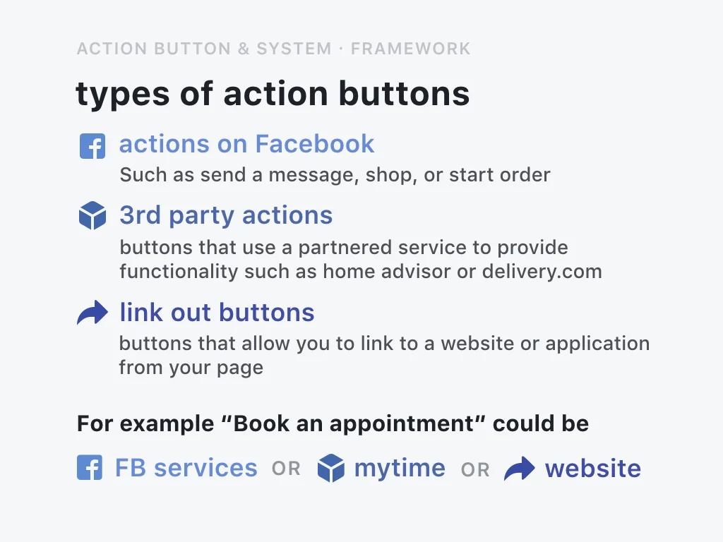
To begin to address the lack of clarity in language and functionality, I worked with a content strategist to begin to frame and categorize our various current and near future action button offerings. We developed general categories that would help to frame and provide clarity to admins setting it up. We also aimed to humanize the language in the set up flow by framing the action button offerings as objective that an admin or business owner might want to do or achieve rather than using language that felt more at home in an advertising product. These early studies also formed a basis of understanding of how this menu might start to take shape
creating a framework

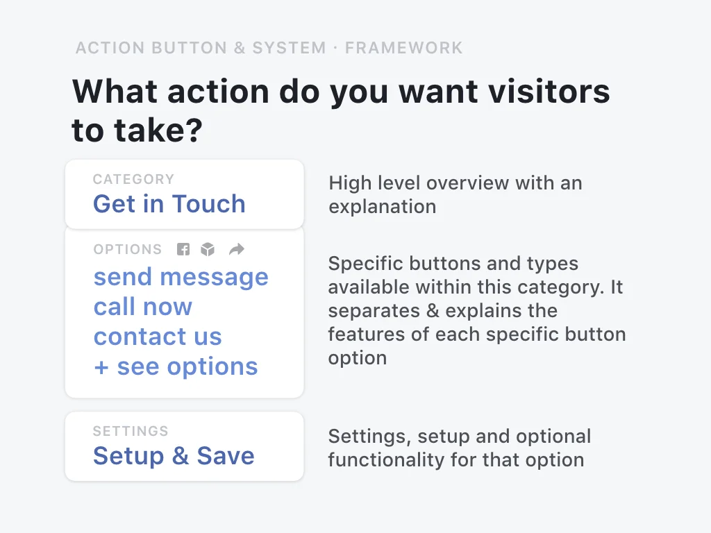
While these conversations about language and organization were occurring, I began iterating on the general structure of the modal, both from a user centered organizational model and a product design standpoint. Since this modal could be accessed from a variety of different entry points, I explored the strongest way to provide context into where you are (Have you set up a button already? Is this the first time you’ve seen this menu? Are you trying to find an action that better suits your goals?) and allow for flexibility to add more button types moving forwards. This included working with the team building 3rd party integrations for your Page. Often these would share or have a very similar name to the Facebook call to actions and part of the scope of this project was to allow the framework to be flexible enough to allow for these third party integrations to have a place alongside the options offered by Facebook.
I settled on an organization structure where similar types of CTAs were grouped into categories with a high level overview of how this button might help them achieve their goals. Within that category were all the specific button options using the button name as the identifier.
testing with users
Once the framework and organization of the process of adding an action button to your page neared completion, we decided to bring it to our stakeholders, actual page owners. For our user tests, I worked with a member of the user research team to develop a script and a prototype. We ran them through the basic flows asking them to compete some of the basic tasks. We asked them if they could find a variety of the actions in both the old and new flow, such as “Sign up,” “Contact Us,” and “Shop Now,” and then having them set up one of the options for their button. To make our participants more comfortable, I recreated their Facebook page to use in the prototype, so they understood the context and changes that we were asking them to make. We ran this user test with six small business owners who came into the Facebook office to participate.
From the test, we were able to gather some great feedback around the language, organization, and new framework. As we hypothesized, calling the main button the “call to action button” was confusing to page owners. The language was too jargon or business-y for them to want to click it, they were unsure if it was going to have to be something they had to pay for or what it was going to do. They preferred when their options were organized into groups, this allowed them to quickly skim and find the overall goal for their business.
conclusion